Interactive concept map guide
A static diagram using colours to show structure and detail
Using Java collection classes as an example

This page explains how to make a lot of data more comprehensible, supplying details within the overall structure.
But you can jump straight to the map: Java collection framework if you know the basics of using SortYourThoughts.
Don't worry, you don't have to understand what is being visualised, you are here to see how SortYourThoughts can help you to visualise YOUR data.
The idea behind a concept map is to make information more accessible and therefore easier to understand.
Here, we look at some information in different ways, which helps us to understand it better.
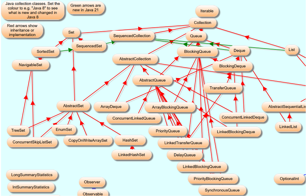
The items (or nodes) show different types of things, interfaces and classes.
We can see which is which using colours:
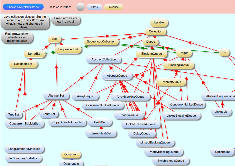
The colour legend is at the top: the classes are light blue, the interfaces beige.
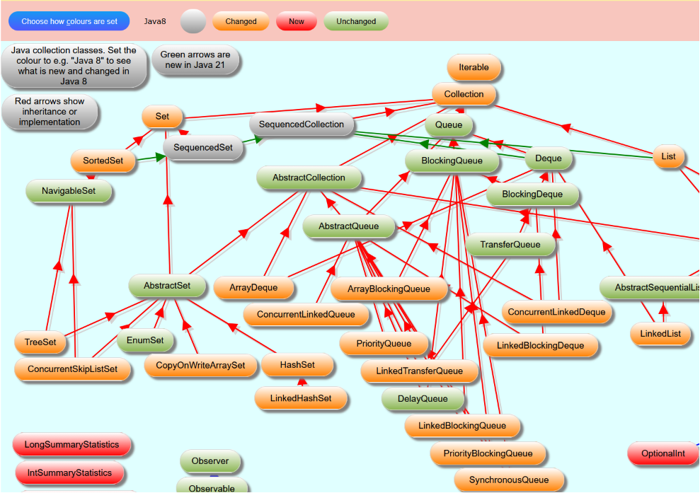
Or we can see which interfaces and classes were changed or added in Java 8. Again, the legend at the top is important.
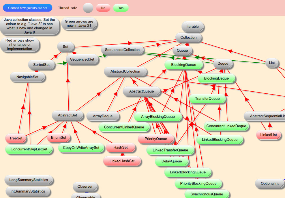
Another important point is whether the classes are thread-safe:
You get the idea.
You can define up to 15 aspects in SortYourThoughts. You've seen the effect of colouring the items according to the aspects "Class or interface", "Java8" and "Thread safe".
-
You can choose which aspect should determine the colouring by clicking on the "Choose how colours are set" button.
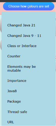
We can define URL as an aspect, so all items can have a link which we open with just 2 clicks: on the item, then on the arrow, the top part of the popup.
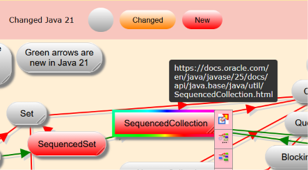
So, your concept map can be a hub from which you navigate to your documents - be they on your computer, in your intranet or in the cloud.
Let's now filter which items we see depending on the values they have for particular aspects.
We are looking for a collection which is thread-safe and whose elements may be mutable.
And we can colour the items depending on another aspect. In this case, whether they were changed in Java 8.
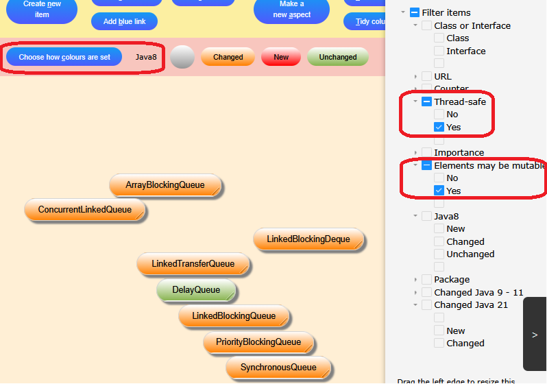
This combination of filtering and colouring can be very powerful in limiting the amount of information we have to see, thereby helping us to understand more clearly.
Now, view the actual concept map and choose how to colour it.
All content is presented as is and may not be 100% accurate or complete. If you find any inaccuracies, please email us.